Craft pen pals

A few years ago I participated in an ornament exchange organized by Blu Penny. It’s sort of pen pals for the holidays. I’m a sucker for buying new ornaments each year so it’s exciting to get them in the mail. 

I’m joining the exchange again this year and there’s still room if you’d like some motivation for holiday crafting. Sign up by November 25th! I suggest joining with friends so you can exchange with your group of local crafters as well as your new pen pals. It’s a good way to quickly grow your handmade ornament collection. 

We’ll see what I come up with this year but in the meantime these are my ornaments from when I participated in 2009.

These  gingerbread men were made with the re-use of brown paper bags. They were a good excuse to bring out my PrismaColor pens and sewing machine. They were finished off with some stuffing, bakers twine and embroidery floss.
Gingerman_01.jpg
These guys were the re-use of trader joes holiday bags. The snowman is my favorite.

Polka-dot Chicago

PolkaDot_01.jpg

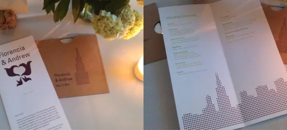
When starting this project the one request I had from the groom was to incorporate the Chicago skyline. Florencia the bride and my former roommate had a few other comments; “I like polka-dots, I like birds, no matchy matchy”. The Polka-dots were no surprise to me since she even had them on her dress. I promise polka-dots on a wedding dress is just the right amount of sophistication and whimsy. That was my personal goal for the invite design.

For the other requests, rather than just putting a bird on it, I used one of her mothers bird sketches. Growing up Florencia always liked her bird drawings and I was happy to use something extra sentimental in the invitation. I suggested the orange envelopes to keep things from being to matchy matchy and because I couldn’t imagine orange not being part of Florencia’s wedding. Living together she brought the gift of orange into my life and I’ve embraced it as a color I like to have around.

As it should be, the final result was a reflection of both the bride and groom. I printed these invites with the assistance of Florencia in March and attended the wedding in early May.

Congratulations Andrew and Florencia!

PolkaDot_02.jpg
PolkaDot_03.jpg

I supplied files for Florencia to produce some extra items for the wedding.

Extras.jpg
Drawings.jpg

Patricia Lebensohn’s bird drawings.

birds.jpg

Paper: French Paper Company, Pop-Tone Whip Cream, 140lb Cover

Envelopes: French Paper Company, Butcher Orange

Inks: Pantone 7650 (aubergine), Pantone 383 (green), self mixed so not perfect

Fire safety

In June my friends had a Luau to celebrate their Hawaiian wedding. I helped out with some of their signage and designed these menu’s to go along with the treasure map invitation they’d mailed everyone.

My parents taught me well and I did practice good fire safety while I burned the edges of the these menus. I burned about four sheets at a time in my backyard fire pit.

Paper: Mohawk, Skytone, Natural Vellum, 65lb Cover

Printing: Good old fashioned xerox